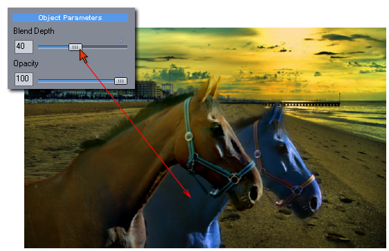
We can lower the blending option with the Blend Depth slider on any of the objects and such object will start behaving more like we are use to in a standard editor.
This has also the ugly downside that all the automatic goodies of Photo Blend (like forgiving masks and automatic color-fit into backdrop) will also go down with it. We can find some middle way of having the cake and eat it too, with a little of blend and still having more of the new intensity to seep through. But I can already see on the blue horse that my mask is showing its ugly side.

I deliberately choose to adjust object intensity, because this type of adjustment is the hardest to compete with the automatic Blend adjustment - Photo Blend want's the object intensity to fit into the backdrop in a sort of "part of the picture" way and if I am making it darker or lighter it will then compensate its intensity so it can still fits fits into the background.
And lets be honest here, making the horse darker by lowering the blend doesn't really make it "part of the picture", not to mention blue horses are like blue roses, out of fashion.
It is important to remember when making any color adjustments that Photo Blend will then try to fit those changes into the feel of the backdrop scene and that may work against you.